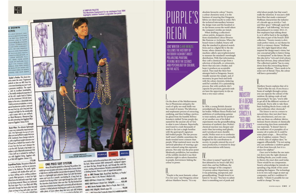
Coast Mountain Culture writer Clare Menzel follows the history of outdoor fashion’s most polarizing pantone, peeking into the science and psychology of colour, in five acts.
I.
On the shore of the Mediterranean Sea in Phoenician antiquity, the crack of spiky sea-snail shells was the sound of money. The laborious and unpleasant process of extracting, oxidizing, and then boiling a particular gland from the humble Bolinus brandaris yielded Tyrian purple dye, named for the ancient city of Tyre in what is now Lebanon. Reportedly, you’d need to crush thousands of snails to dye just a single hemline with the gastropod’s signature full-bodied purple. The dye process itself wasn’t reliable; sometimes the shade trended more crimson than purple. What mattered more was the sartorial splendour of wearing a garment coloured using this expensive process. Not only was the price point fabulously prohibitive, but members of the nobility decided it was their exclusive right to adorn themselves in purple, forevermore linking the colour to power.

II.
“Purple is the most fantastic colour I’ve ever seen,” says Patagonia colour advisor Matthew Swartz. “It is my absolute favourite colour.” Swartz, a colour chemistry nerd, is in the business of ensuring that Patagonia fabrics are dyed exactly to order. He’s the technical intermediary between the design team and the hundred or so dye houses across the world where the company’s textiles are tinted. When drafting a collection’s colour palette, designers choose from standardized colour libraries like Pantone or Archroma. When the brand vision is dialled, Swartz will ship the standard in physical swatch form and in a digital file to the dye house, where chemists fire up a machine called a spectrophotometer to measure the standard’s wavelength distribution. With that information, they craft a chemical recipe from a selection of dyestuffs, or colourants, throw that mix into a beaker, and hope it produces an acceptable match. They mail the three best attempts back to Patagonia. Swartz visually assesses the sample, and, if necessary, he goes back and forth with the colour chemists, tinkering until he’s satisfied. It’s a painstaking process. But with synthetic dye’s capacity for precision, garment makers have the opportunity to dye an item a very exact colour.
“You have to admit there is something sort of punk and rebel about purple.” – Ian Hoffman, senior manager of the colour department at Arcteryx.
III.
In 1856, a young British chemist serendipitously discovered purple in his beaker. William Henry Perkin had ambitions of synthesizing quinine to treat malaria, and the by-product of yet another one of his failed experiments was the groundbreaking invention of synthetic dyes. Perkin’s chemical reaction was cheaper and easier than harvesting snail glands, and it produced more durable results. Perkin went on to synthesize other colour dyes and was eventually knighted for his contributions to society. As purple entered the era of mass production, it retained its deep-seated associations with luxury.

IV.
The colour is named “squid ink.” It first debuted in Arc’teryx’s fall 2012 men’s line, and Ian Hoffman, the senior manager of the company’s 14-person colour department, says it was polarizing, unexpected, and groundbreaking. “People loved it or hated it,” he says. “You have to admit there is something sort of punk and rebel about purple, but that wasn’t really the intention. It was just a shift from blue that made a statement.” Hoffman characterizes the industry of a decade ago as strictly a “red-and-blue space.” Although squid ink did gain a “cult following,” Arc’teryx discontinued it in winter 2012–13. But employees kept talking about it, so it will be back in the spotlight, this time as part of the brand’s 2020 collection. “Twenty-twenty is obviously perfect vision, so our theme for 2020 is a visionary theme,” Hoffman says. He’s tight-lipped about what inspired the design team’s vision, but one conceptual pillar is history being “re-interpreted” as the future. He says this idea led to “rich and vivid colours that had obvious, deep cultural links.” The collection’s palette “has to come down from this overarching theme,” explains Hoffman. “There needs to be some sort of thread. Then, the colour will have personality.”
V.
Matthew Swartz explains that oil is “kind of like the sun. If you focus a beam of sunlight through a prism, you can separate the colours of the rainbow. By taking crude oil and processing it,” he says, “you’re able to get all of the different varieties of chemicals. You’re able to take these basic building blocks from crude oil and synthesize other chemicals.” The future is not in a return to natural dyes; they just don’t have the colourfastness, and you can only use them on cellulosic fabrics. Instead, Swartz dreams of chemically constructing dyes from sustainable raw materials. “It doesn’t have to be sunflower oil or pumpkin oil or sesame oil or palm oil. It could be some plant scraps . . . . Broccoli has a lot of sulphur content. There’s a whole class of sulphur dyes,” he suggests offhandedly. “I’m not saying you can synthesize a rainbow gamut of dyes from broccoli, but it is a source for sulphur.” Once you’ve broken the raw material down into the right chemical building blocks, you could create, in theory, the exact dyes used today. There would be no compromise. Swartz acknowledges he intends on spending a big chunk of his career making this happen. The technology is in its very early stages at start-up companies, and he’s confident it’s doable. “I think it’s possible for our world to change,” he says.
Clare Menzel
Clare is an East Coaster who found her way west and who now lives in Northwest Montana. She is a regular contributor to Kootenay Mountain Culture Magazine.
Related Stories
History of Ski Aerial Acrobatics
One of the most influential ski films of all time. Dick Barrymores documents what started freestyle skiing. From 1969…
The Future of Outdoor Filmmaking
Having seen some of this technology at work recently, most notably at the Red Bull Cold Rush at Retallack Lodge this…
Calgary Outdoor Expo and Festival Oct 30-31
The first-ever Calgary outdoor expo and festival is set to take place this upcoming Saturday and Sunday, next to…
Outdoor Gear from Here: Introducing Kootenay Outdoor Recreation Enterprise
British Columbia’s Kootenay region is now home to KORE, Canada’s First Craft Outdoor Gear Alliance. In the context of…
Honest Review: Roscoe Outdoor Pants
Finding an awesome women's backpacking pant is not an easy task. We sent editor Clare Menzel out to review two such…


